Weather Cards
Single-day and multi-day weather cards for conversational interfaces.
In an agent response
A reasoning and tool workflow that resolves into a Weather Card.
Playback started.
Single-day Weather
A focused card for one day's weather conditions.
 24°C
24°CCustomize
Multi-day Weather
A detailed card with today's conditions and five future days.
 Clear day:25°CPartly cloudy day:24°C
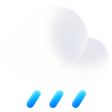 Rain:21°C
 Wind:22°CClear day:26°C
Weather Cards are rich response cards for AI assistants: when a chatbot or agent answers a forecast question, the reply renders as a single-day card or a detailed multi-day forecast instead of a text blob. Both are React components built with shadcn/ui and Tailwind CSS; they install from the registry and take plain props your agent can fill from any weather API.
API reference
Single-day Weather
| Prop | Type | Default | Description |
|---|---|---|---|
condition | WeatherCondition | "partly-cloudy-day" | Selects one of the ten built-in weather icons. |
location | string | "Sydney" | Displays the weather location. |
conditionIconSrc | string | selected condition icon | Overrides the selected condition with another icon URL. |
conditionDescription | string | "Partly cloudy with sunny breaks..." | Describes the current conditions in text. |
temperature | string | "24°C" | Displays the formatted current temperature. |
background | React.CSSProperties["background"] | blue gradient | Sets the Card background. Keep enough contrast with the fixed white text. |
Single-day Weather also accepts the standard shadcn Card props, except
children and size.
Multi-day Weather
| Prop | Type | Default | Description |
|---|---|---|---|
size | "default" | "lg" | "lg" | Controls the card typography and internal scale. |
condition | WeatherCondition | "partly-cloudy-day" | Selects the main condition icon. |
conditionIconSrc | string | selected condition icon | Overrides the main condition icon URL. |
location | string | "Sydney" | Displays the weather location. |
conditionDescription | string | "Partly cloudy with sunny breaks..." | Describes the current conditions in text. |
lowTemperature | string | "17°C" | Displays the muted low temperature. |
highTemperature | string | "24°C" | Displays the emphasized high temperature. |
days | readonly WeatherDay[] | five Sydney weather items | Renders weather items in the supplied order. |
background | React.CSSProperties["background"] | blue gradient | Sets the Card background. Keep enough contrast with the fixed white text. |
Each WeatherDay contains condition, temperature, and an optional
conditionIconSrc. Multi-day Weather also accepts standard shadcn Card props,
except children and the Card's own size prop.
Conditions
The condition values are clear-day, partly-cloudy-day, overcast,
drizzle, rain, thunderstorm, snow, wind, clear-night, and
partly-cloudy-night.
Credits
The information layouts are adapted from the ChatKit Weather Current and ChatKit Weather Forecast examples and composed with the official shadcn Card.
The bundled ten-icon weather set is an AI-assisted original asset collection created for Vivid Layer with OpenAI image generation. Its soft-clay and frosted-glass direction was inspired by the four icons in those ChatKit examples. No original OpenAI asset files are included, and Vivid Layer is not affiliated with or endorsed by OpenAI.